

Creating a Standout Mocktail Brand in Two Weeks
Setting the Stage
Zero Proof was a two-week collaborative project completed as part of the Fall 2025 GIT 450/550 course, led by Creative Director Cameron Rennacker. The assignment asked us to imagine, design, and launch a completely new alcohol-free mocktail brand from scratch. With only two weeks to go from concept to launch, the project demanded strong time management, quick decision-making, and clear collaboration across multiple disciplines. It provided a realistic simulation of how a creative agency might build and deliver a brand under a fast-paced deadline.
Defining the Brand Challenge
The central challenge was to create a mocktail brand that balanced sophistication with approachability while also carving out a unique identity in the growing zero alcohol market. At the beginning, our team struggled with direction because the brand identity was not yet fully established, which made it difficult to align content with a clear visual language. As we refined our ideas, we selected an avatar inspired theme that gave each flavor its own color, mood, and mythical persona such as The Fool and The Oracle. This tarot card inspired concept gave us a distinctive way to express personality and symbolism across the brand, and once the theme was set, we had a strong foundation to build content around.
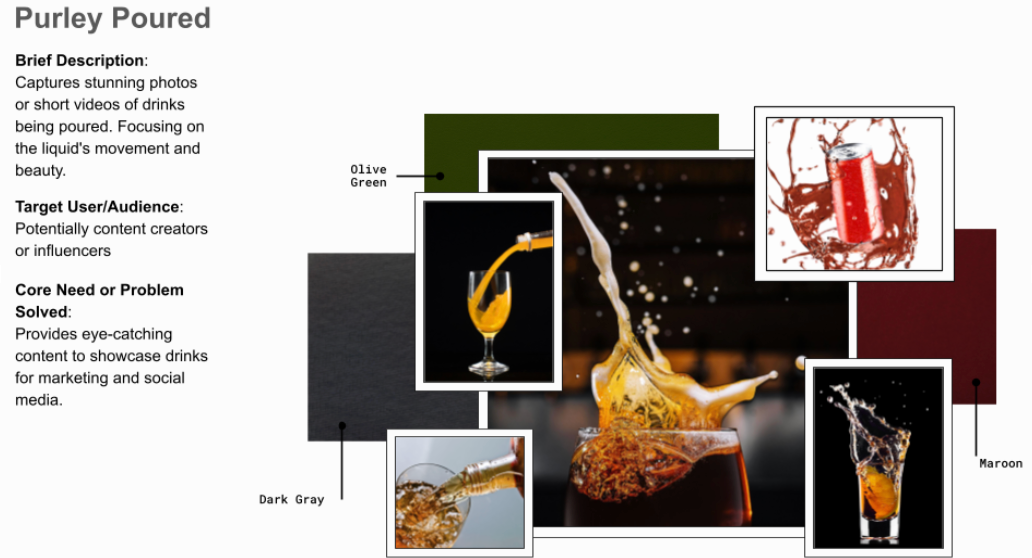
‘‘Purely Poured,’ one of my early concepts, captures drinks mid-pour with splashes and motion, creating bold, eye-catching visuals later used in our videos.
Cross-Team Collaboration
To achieve this, our class was organized into four specialized teams: Brand, Web, Content, and Packaging. Each team had distinct responsibilities but depended on one another to create a cohesive final product. The Brand Team developed the logos, color schemes, and typography that would define the brand’s identity. The Web Team designed and built the digital presence where the story of SagaV, the name chosen for the brand, would come to life online. The Packaging Team created bottles and labels that communicated a premium yet approachable feel. My team, Content, produced photography and video that captured the SagaV lifestyle and engaged potential customers. This structure mirrored a professional creative workflow and required clear communication across teams to maintain consistency.
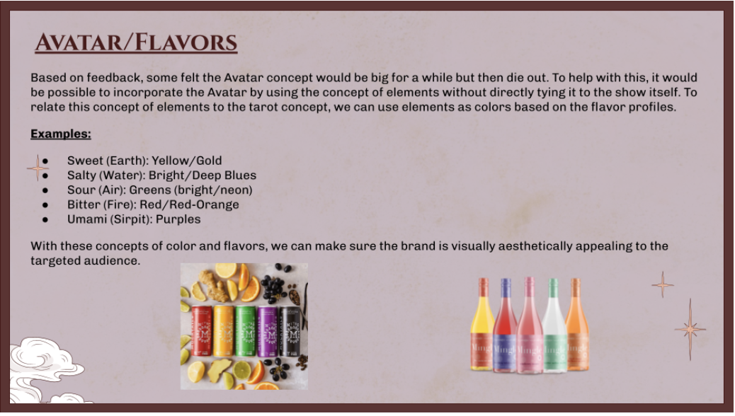
The early ‘Avatar/Flavors’ concept linked each drink to an elemental color palette, laying the groundwork for the tarot-inspired, character-driven brand identity.
Crafting Content That Resonates
On the Content Team, our goal was to bring the avatar concept into real world contexts through photography and short form videos. Each piece of content was designed to capture not only the product but also the personality tied to its mythical character. For example, colors, lighting, and props helped reinforce the archetypes of The Fool and The Oracle, making the drinks feel alive and connected to a larger narrative. We wanted the content to feel authentic, relatable, and aspirational so that audiences could connect with the lifestyle and storytelling aspects of the brand.
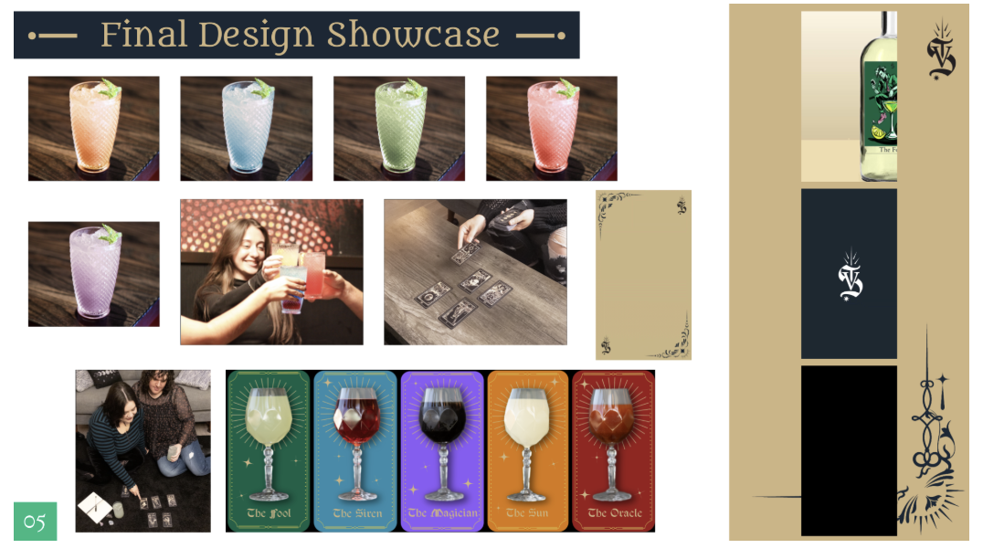
The final showcase combined photos, product shots, and video to express SagaV’s tarot-inspired brand through color, mood, and character.
Editing Videos for Social
My primary responsibility was editing and preparing video content for social platforms. Using Adobe Rush, I refined our clips to ensure they were polished and visually consistent with the tarot inspired branding. I also resized and optimized them for Instagram and TikTok so they would display correctly across devices. One of the videos I edited highlighted the variety of drinks, emphasizing the unique colors and moods of each character. Another video captured a bar environment, situating the mocktails in a familiar social setting while still echoing the mystical theme. These edits involved making choices about pacing, framing, and transitions to keep viewers engaged and to align with the storytelling direction.
A slow pan of a bar with SagaV mocktails highlights color, texture, and atmosphere, reflecting the brand’s tarot-inspired, sophisticated yet approachable vibe.
Cinematic pan of a moody bar showcasing SagaV mocktails with warm lighting and textured details, reflecting the brand’s tarot-inspired identity.
Bringing the Brand to Life
The final deliverables brought SagaV together as a cohesive and imaginative brand. The avatar theme, which merged into mythical characters rather than elements, tied everything together across packaging, web, and content into one recognizable identity, while the videos I produced helped communicate how these drinks could fit into both everyday and social lifestyles. The tarot inspired characters gave the project a unique creative edge that made the brand more memorable.
This experience taught me the importance of aligning content with evolving brand direction and being adaptable when concepts shift mid project. Once the visual theme was set, our work accelerated and came together with clarity and purpose. Looking ahead, I am excited to build on this by exploring how creative theming can be pushed even further through interactive content and expanded storytelling across platforms.
This project was a collaborative effort by Claire Ellis, Clariza Johnson, Andres Galindo, Austin Solache, Bailey Jerome, Imani Rojas, Patricia Lucas, Nicole Miller, Danny Valdez, Sonny Mallett, Tyler Martin, Linnea Mangan, and Anes Hussain.